


Unsilenced Science’s chart of average SAT scores by race from 1941-2019 has attracted accusations of bias due to his or her using easily recognized colors to represent each race: e.g., a black line represents blacks while a yellow line represents Asians.
As everybody knows, respectable institutions try to make their color schemes as hard to read as possible. iSteve commenter Calvin Hobbes points to this masterpiece of the inscrutable from an official University of California website entitled “The Facts: Diversity:”

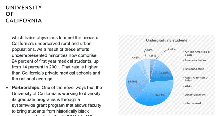
The pie-chart color scheme is “shades of blue”, with some of the shades differing only slightly from each other.
The shades-of-blue coding also differs from graph to graph.
None of this invidious coding of different groups with different colors.
 The pie-chart color scheme is “shades of blue”, with some of the shades differing only slightly from each other.
The purpose of official diversity graphs is not to communicate facts about diversity, they are to give us something to blankly stare in the direction of while we think about something else.
[Comment at Unz.com]