


From National Review:
Different Races, Same Boat
By MIKE LEEMIKE LEE is the senior U.S. senator from Utah.
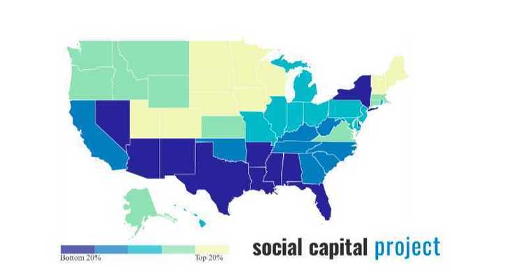
January 21, 2019 6:30 AM… For two years the Social Capital Project of the Joint Economic Committee has studied the health of families, communities, and civil society, documenting changes in social capital over time and its uneven geographic distribution across the country. One striking finding from the project was that ten of the eleven states with the lowest social capital — as measured by an index we created — and 17 of the bottom 20 fall within a continuous bloc running across the southern part of the country.

Looks to me like Moynihan’s Law of the Canadian Border (the closer a state’s capital is to the Canadian border, the higher school test scores and other metrics of Nice Things it is likely to have).
It was beyond the scope of our report to fully explain the reasons for this concentration of disadvantage, but we noted that these geographic patterns suggest deep-seated problems. The facts eventually led us to a troubling, but revelatory, correlation.
One of the seven components of our Social Capital Index measures the prevalence of marriage and intact families in a given area (the darker the blue, the worse the score). We then overlaid our county-level map of this “family unity” index with a map depicting the share of those counties’ 1860 population that was enslaved (the more red dots, the higher the proportion of slaves). Here’s what we found:

The correlation is far from perfect. But as you can see, it is unmistakable, although the data are separated by 150 years.
Or you could likely get an even closer correlation by drilling down to the neighborhood Census Tract and plotting the percentage of Non-Asian People of Color: e.g., Detroit didn’t have much slavery in 1860, but it doesn’t have a lot of Social Capital today.
That reality is hard to show in a map of counties because black populations in the north are so concentrated in cities that, say, Cook County or Wayne County look like tiny dots on the US map. In contrast, there are more rural blacks in the South, so their presence, even when euphemized through a slavery-in-1860 metric, is easier to see on a map.
The institution of slavery stole agency from African Americans, for generations. Families were regularly split up, with children torn from their parents and spouses from each other. Black women were often sexually assaulted by their “owners.” Husbands and fathers were prohibited from exercising the authority that men at the time were supposed to wield. They were neither breadwinners nor protectors but were instead subjected to violent humiliation and abuse at the hands of the privileged few who profited from the arrangement.
But, oddly enough, black illegitimacy rates weren’t all that terrible for the first 100 years after slavery, but then exploded when welfare for single mothers was boosted in the 1960s. And oddly enough, illegitimacy rates soared first far away from where slavery was found in 1860, in places like New York, Ohio, and Michigan where pro-civil rights liberalism was triumphant.
Update: Bay Area Progressive Coalition points out that Washington Post columnist Megan McArdle did an artful job of both Noticing and being Tactically Obscure at the same time in her discussion of these maps:
The maps provided by the Joint Economic Committee suggest that migration may indeed have persistent effects on social trust — that historical events can build or deplete our social capital even centuries later. When you get down to the county level, it looks as if the stronger areas on the map are dominated by settlement from just three of America’s many immigrant waves: Puritans in the 17th century and Scandinavians and Germans in the 19th. The weaker spots, on the other hand, seem to trace the twin realms of Spanish colonialism and King Cotton.

The “twin realms of Spanish colonialism and King Cotton”—I’m impressed! Nobody will Cancel her for blaming the King of Spain for the cruddiness of San Bernardino County today, and two, perhaps three percent of her readers will get the joke.