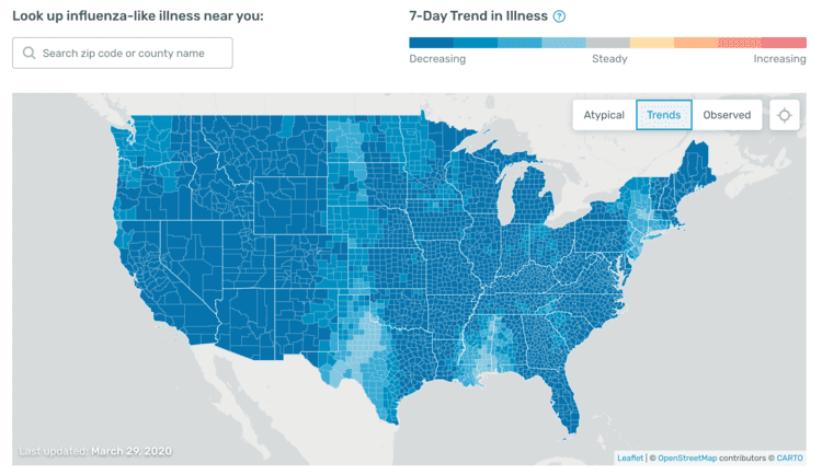
A company called Kinsa sells “smart thermometers” that snitch on your degrees of fever to their central website HealthWeather.US. They get about 160,000 readings per day from across the country. Lately, after a bad spell in mid-March, feverishness has been falling.
![]()
Of course, some of that is due to non-COVID infections falling as Americans socially distance. The blue striped line attempts to estimate the normal decline in run of the mill fever infections.
From the New York Times:
Restrictions Are Slowing Coronavirus Infections, New Data Suggest
A database of daily fever readings shows that the numbers declined as people disappeared indoors.
By Donald G. McNeil Jr.
March 30, 2020 Updated 6:52 p.m. ET
… But the new data offer evidence, in real time, that tight social-distancing restrictions may be working, potentially reducing hospital overcrowding and lowering death rates, experts said.
The company, Kinsa Health, which produces internet-connected thermometers, first created a national map of fever levels on March 22 and was able to spot the trend within a day. Since then, data from the health departments of New York State and Washington State have buttressed the finding, making it clear that social distancing is saving lives.
The trend has become so obvious that on Sunday, President Trump extended until the end of April his recommendation that Americans stay in lockdown. Mr. Trump had hoped to lift restrictions by Easter and send Americans back to work. …
The company normally uses that data to track the spread of influenza. Since 2018, when it had more than 500,000 thermometers distributed, its predictions have routinely been two to three weeks ahead of those of the Centers for Disease Control and Prevention, which gathers flu data on patient symptoms from doctors’ offices and hospitals.
To identify clusters of coronavirus infections, Kinsa recently adapted its software to detect spikes of “atypical fever” that do not correlate with historical flu patterns and are likely attributable to the coronavirus.
As of noon Wednesday, the company’s live map showed fevers holding steady or dropping almost universally across the country, with two prominent exceptions.
![]()
One was in a broad swath of New Mexico, where the governor had issued stay-at-home orders only the day before, and in adjacent counties in Southern Colorado.
Also looks like the Great Plains and Mississippi are not doing as well in terms of trend as the rest of the country, probably because they weren’t visited by too many Milanese fashionistas in February, so are only now getting whacked for the first time. The Greater New York area still has problems as well, although the trend is in the right direction, just not enough.
The second was in a ring of Louisiana parishes surrounding New Orleans, but 100 to 150 miles away from it. That presumably was caused by the outward local spread of the explosion of infections in New Orleans, which officials believe was set off by crowding during Mardi Gras.
By Friday morning, fevers in every county in the country were on a downward trend, depicted in four shades of blue on the map.
Fevers were dropping especially rapidly in the West, from Utah to California and from Washington down to Arizona; in many Western counties, the numbers of people reporting high fevers fell by almost 20 percent. The numbers were also declining rapidly in Maine.
The parts of New Mexico and Colorado that had been slightly “warm” on Wednesday were in light blue, indicating that they were cooling. So were the Louisiana counties.
As of Monday morning, more than three-quarters of the country was deep blue. A separate display of the collective national fever trend, which had spiked upward to a peak on March 17, had fallen so far that it was actually below the band showing historical flu fever trends — which meant that the lockdown has cut not only Covid-19 transmission but flu transmission, too….
For some hard-hit cities, Kinsa also sent The New York Times fever data plotted on a timeline of restrictions enacted by mayors or governors.
Those graphs, Dr. Schaffner noted, showed that simply declaring a state of emergency or limiting the size of public gatherings did not affect the number of people reporting fevers.
But closing restaurants and bars and asking people to stay in their homes produced dramatic results in all three cities.
For example, in Manhattan, reports of fevers steadily rose during early March, despite a declaration of emergency on March 7 and an order on March 12 that public gatherings be restricted to less than 500 people.
The turning point began on March 16, the day schools were closed. Bars and restaurants were closed the next day, and a stay-at-home order took effect on March 20. By March 23, new fevers in Manhattan were below their March 1 levels.
Last Friday, New York State’s own data showed the same trend that Kinsa’s fever readings had spotted five days earlier.
The state tracks hospitalization rates, not fevers. So many patients were being admitted to New York City hospitals, Gov. Andrew M. Cuomo said, that until March 20, hospitalization rates were doubling roughly every two days.
By Tuesday, the hospitalization rate took four days to double. This is roughly what the fever readings predicted, said Nita Nehru, a company spokeswoman.
Hospitalizations occur several days after symptoms like fever appear. “The cases being counted now had fevers five to 10 days ago,” she said. …
On Friday, the University of California, San Francisco, said its hospitals were not facing a huge surge of patients and gave the credit to the strict shelter-in-place orders imposed by Mayor London Breed on March 16. …
Confirmed cases will keep going up for days, because people do not always go for a Covid-19 test the same day they feel feverish. Besides, many states are doing more tests every day.
[Comment at Unz.com]