


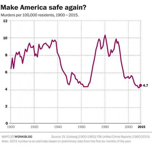

Here’s a graph going around to show you that there’s nothing to worry about in the big spike in urban homicides since Ferguson: look, the murder rate is down compared to the Carter Administration! For example, Democratic-connected journalist-financier Steven Rattner tweets:
Trump paints a bleak picture of crime but stats show murder rates are at historic lows. #RNCinCLE pic.twitter.com/vi93vUQZNq
— Steve Rattner (@SteveRattner) July 22, 2016
But take a look at the single most dominant notable feature of the graph: the huge increase in murders in the second half of the 1960s and the first half of the 1970s when liberals took charge of the criminal justice system:
Wow.
It might make you think twice about the new Abolish Mass Incarceration conventional wisdom whose rise has coincided (perhaps not coincidently) with the 17% increase in homicides seen in the 50 biggest cities in 2015 over 2014.
Thanks, Mr. Rattner. Your graph is much appreciated.