A couple of the graphs in my new Taki’s Magazine column “Let’s Be Over and Done in ’21” are drawn from some emails I received recently from somebody I’ve distantly known for a long time as a reliable, sensible analyst. Here’s his first email, with graphs and commentary beneath the graph (i.e., when he says, “Here is a graph” he’s referring to the graph above his text, not below).
I put together some graphs about COVID deaths and overall deaths with a little commentary here: https://imgur.com/a/JBjbJCw
You’ll have seen ones like most of them, but some may be of interest to you.I haven’t published the post anywhere yet. Maybe I’ll put in on twitter. Have I mentioned how much I hate twitter?
Some graphs about the seriousness of the COVID pandemic in the United States
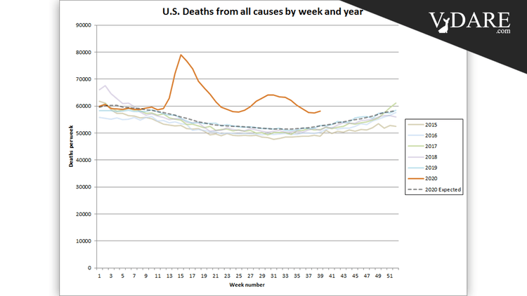
![]()
The dashed line is CDC’s “Average Expected Count” of deaths. It is a smoothed extrapolation of recent years trends in deaths. Because it is a trend analysis, it implicitly accounts for population growth and aging. The number of deaths this year is extremely elevated above the expected deaths line.
Let me point out that these graphs cautiously cut off around the end of the third quarter before the current third wave really got going over the last month or so. The CDC assigns deaths to the date on the death certificates. But it can take each state’s death certificates up to 8 weeks to trickle into the CDC.
![]()
Sometimes people claim that the number of COVID deaths is exaggerated. But even if you subtract the number of COVID deaths from the number of total deaths, what’s left over is still an alarmingly elevated death rate.
![]()
Another way of graphing the same data. Again we see that even if you subtract the number of COVID deaths from the number of excess deaths, what you’re left with is still a huge number. The residual deaths are still in the shape of the COVID deaths, strongly suggesting that COVID deaths are undercounted.
![]()
Excess deaths by age group also matches well with COVID deaths by age group.
![]()
Sometimes people suggest that many of the excess deaths could be due to suicides, overdoses, etc., caused by the hardships of lockdowns. Here we graph deaths from natural causes (which excludes homicide, suicide, accidents, overdose, poisonings). The increase in natural deaths account for about 95% of the excess deaths.
![]()
The CDC has not released any numbers on non-natural cause deaths, but we can subtract the number of natural cause deaths from the number of all deaths and get this graph. We see that the number of non-natural cause deaths is significantly elevated, but nothing to the extent of natural cause deaths. I estimate that the increase in non-natural cause deaths is about 13,000 to 16,000 through week 35, accounting for 5 to 6 percent of excess deaths in that period.
There is apparently a lot more lag in reporting of these deaths —presumably because of delays in forensic autopsies— so I put in a dashed line for numbers that will rise as more data comes in.
![]()
Here we have the 2020 death rate (deaths divided by population) compared to the previous decade. Anybody who says this is like a bad flu season is very wrong.
![]()
We won’t have a firm grasp on the number of deaths in November and December until February or March of next year, but the total deaths in 2020 will be at least 3.2 million and likely above 3.3 million. The death rate will jump to at least 9.8 deaths per 1,000 population and probably to 9.9 or higher. This graph shows an estimate of 9.8. This year will have the highest death rate in more than 70 years.
The one-year jump in death rates will be 13% or more. Since penicillin was invented, the highest one-year jump had been 3.5%, so 2020 is about 4 times worse than the previous worst year since World War II.
The only worse year on record is 1918, where deaths rose an estimated 29%. National records go back to 1900, but before 1933 only some states (“death-registration states”) were included.
Anyway, there are spreadsheets on Google to go with them:
US Deaths by year and week
https://docs.google.com/spreadsheets/d/1qucznpabG1aUz0GSiDbiv0-Uy16wUhxOqiEdDYHyqYE/editExcess deaths and COVID deaths
https://docs.google.com/spreadsheets/d/1Lj_ALt5YY9x2Fx3jTZj6XTVDZXjJBnrigrMNZSy4Pew/editWeekly counts of deaths by select causes, United States
https://docs.google.com/spreadsheets/d/1G31ODc4eVgzg7etmcCV5SUfeFTtFYWN8YA4M3RkXYSw/editU.S. death rate
https://docs.google.com/spreadsheets/d/1m3YJ55Zw5AdKaYb8b1HAHsfcPAintWIVDZFOdjb-VVo/editComparison of deaths by age Weeks 11 and 15
https://docs.google.com/spreadsheets/d/132VrxxZMYpVwa1Flhvd32iBDJAvtG-mVkKQ7ECItPPc/edit
This one is because of the controversy about that article in the Johns Hopkins student magazine.U.S. Excess deaths by age
https://docs.google.com/spreadsheets/d/1rcGoWRsNxS_zJQ3pJtbWn-eh-i4kxMTSWmhh4qlTFl4/edit
Feel free to do what you want with these. Let me know if you have any comments or questions.
And here’s a later email with some more technical analyses of common objections to the earlier work:
A couple of extra points that were not in my imgur album.
The spreadsheet “Weekly counts of death by select causes” has deaths categorized by the Underlying Cause of Death (UCOD) except for the one sheet that’s labeled “COVID-19 (Multiple Cause of Death)”.
If you’re not familiar with death certificates (I wasn’t until October), there’s a PDF about how to fill them out for COVID here: https://www.cdc.gov/nchs/data/nvss/vsrg/vsrg03-508.pdf
That’s from this page: https://www.cdc.gov/nchs/covid19/coding-and-reporting.htm
So the sheet Influenza and Pneumonia in the “Weekly counts of death by select causes” spreadsheet is only those deaths where the UCOD is influenza or pneumonia.
It looks like this:
![]()
There was an average flu/pneumonia season up through week 10, then there’s a surge of pneumonia, which is obviously undiagnosed COVID.
For most of the rest of the year the number of pneumonia deaths is very close to other years, which leads me to think that doctors are doing a good job separating COVID pneumonia from other pneumonia on death certificates.
But the CDC also publishes numbers on all deaths involving pneumonia, even when it’s not the UCOD. That is on a sheet in one of the other spreadsheets: https://docs.google.com/spreadsheets/d/1qucznpabG1aUz0GSiDbiv0-Uy16wUhxOqiEdDYHyqYE/edit#rangeid=374070885
![]()
Holy shit!
You probably saw the bullshit going around a couple of months ago about how “only 6 percent of COVID deaths are really COVID” because only 6% of COVID death certificates just had COVID and no other conditions (in either part 1 or part 2 of death certificate).
Table: https://www.cdc.gov/nchs/nvss/vsrr/covid_weekly/index.htm#Comorbidities
The number one comorbidity is and was “Influenza and pneumonia” which is almost all pneumonia. At the time there were about 90,000 COVID death certificates with “Influenza and pneumonia” as a contributing condition. And there were also about 90,000 more pneumonia deaths in 2020 than 2019.
It’s also interesting to compare the comorbidities table to a table in my spreadsheets: https://docs.google.com/spreadsheets/d/1G31ODc4eVgzg7etmcCV5SUfeFTtFYWN8YA4M3RkXYSw/edit#gid=103941076
Here are some things about flu that I have learned (I vaguely knew some of this before).
The number of reported deaths for flu (influenza on the death certificate) is much smaller than the number that the CDC estimates from a model.
Flu season Reported deaths Estimated deaths Range
2010-2011 1,940 37,000 (32,000 – 51,000)
2011-2012 738 12,000 (11,000 – 23,000)
2012-2013 4,626 43,000 (37,000 – 57,000)
2013-2014 4,485 38,000 (33,000 – 50,000)
2014-2015 8,197 51,000 (44,000 – 64,000)
2015-2016 3,448 23,000 (17,000 – 35,000)
2016-2017 6,954 38,000 (29,000 – 61,000)
2017-2018∗ 15,620 61,000 (46,000 – 95,000)
2018-2019∗ 7,175 34,000 (26,000 – 53,000)
2019-2020∗ 9,427 22,000 (18,000 – 29,000)
∗ Note: 2017-2018 and later are preliminary estimates.
Flu deaths are extremely seasonal. About 96% of flu deaths occur in 26 weeks and only 4% in the other 26 weeks.
See also this graphic from the CDC:
![]()
There is a real drop in the amount of flu virus going around. See this article: https://www.scientificamerican.com/article/flu-season-never-came-to-the-southern-hemisphere1/
Also, compare the numbers (especially positivity rate) from the CDC in 2020-2021 to 2019-2020 season: https://docs.google.com/spreadsheets/d/1yjc2QA30sRtra87BSClCR0ctcXwrC7amazBWMcevDiA/edit#gid=1017897125
Flu deaths normally increase rapidly in the last week or two of December and then stay high through March. I think it will be much lower this season.
[Comment at Unz.com]